An effective audit dashboard is a continuous, evidence-backed control view that ties every metric to testable evidence and a named owner. It is not a static report reformatted as a chart, and it is not a collection of colour-coded tiles that look authoritative but cannot survive a question from an auditor. If a number on screen cannot be traced back to a source record, a timestamp and a person accountable for it, the dashboard is decoration.
Get the fundamentals right and the rest of audit dashboard design follows. Every credible build needs:
- Live RAG roll-ups calculated from current data, not last month's snapshot
- Evidence links attached to every metric, click-through to the source document or log
- A named owner and an SLA against every open finding or control gap
- Timestamps on every data point showing when it was last refreshed
- An exception queue that surfaces breaches automatically rather than waiting for a quarterly review
Platforms such as Intelligentassessments build continuous assurance dashboards around exactly this pattern, replacing static spreadsheet trackers with a live, single source of truth.
Key Takeaways
Audit dashboards only earn trust when every metric traces back to timestamped, owned evidence within a single shared data model.
| Point | Details |
|---|---|
| Evidence before visuals | Build the evidence pipeline and metadata standards before designing any chart or layout. |
| One data model, three views | Serve executive, operational and audit audiences from the same dataset to prevent mismatched numbers. |
| Explainable AI is mandatory | Any AI-generated summary must trace back to the specific rule and data that produced it. |
| Rotate metrics, keep balance | Refresh secondary metrics quarterly and include positive indicators to avoid dashboard fatigue. |
| Platforms built for this | Intelligentassessments links evidence, RAG roll-ups and AI summaries within one continuous assurance platform. |
Table of Contents
- What design principles should assurance teams insist on?
- Designing evidence pipelines: what to capture, and how to store it
- How should dashboard architecture keep data live and consistent?
- Which metrics and visuals actually drive action?
- How do you embed dashboards into daily assurance workflows?
- What most teams get wrong about audit dashboard design
- How Intelligent Assessments supports this design approach
- Sources
What design principles should assurance teams insist on?
Most dashboard failures trace back to four design decisions made badly at the start. Get these wrong and no amount of visual polish fixes the underlying problem.
- Build modularly and deploy in phases. Academic work on principled automation in continuous assurance recommends modularity and phased rollout specifically because it lets teams validate one control area before scaling, rather than launching an enterprise-wide dashboard that nobody trusts on day one, as outlined in research on principled automation and continuous assurance.
- Enforce one data model. Executive, operational and audit views must pull from the same underlying dataset. Two dashboards showing different completion rates for the same programme destroys credibility faster than any missing feature.
- Rotate what gets attention. Boards stop looking at dashboards that show the same twelve metrics every quarter. A quarterly "spotlight" theme, alongside a stable core, keeps the audience engaged without diluting the fixed metrics that matter.
- Make every metric explainable. If a RAG status flips from green to amber, someone should be able to see exactly which rule, threshold or data point caused it, in plain language, within seconds.
Pro Tip: Before approving any dashboard build, ask the vendor or architect to click through from a single RAG tile to the raw evidence behind it, live, in the demo. If that path takes more than two clicks, the evidence pipeline is not mature enough.
Designing evidence pipelines: what to capture, and how to store it
A dashboard is only as defensible as the evidence sitting behind it, which is where Excel auditing tools for teams can enhance your automation and evidence gathering workflows. Continuous assurance depends on automated evidence pipelines that pull artefacts from source systems the moment they are generated, rather than someone manually screenshotting a spreadsheet once a quarter, an approach detailed in work on continuous auditing versus point-in-time audits.
Capture, at minimum, these evidence types for every control or finding:
- System logs and access records pulled directly from source
- API outputs and automated test results
- Approval records and sign-off trails
- Configuration snapshots showing system state at the point of assessment
Each item needs metadata attached: source system, exact timestamp, the query or rule that generated it, an owner, and a hash or other immutability marker proving it has not been altered since capture. The Cloud Security Alliance's Continuous Audit Metrics Catalog offers an initial set of 34 metrics mapped to a controls framework, a useful reference point when deciding which evidence types actually justify automated collection versus which remain manual for now.
Gaps show up fastest when a metric has no linked evidence at all, or when the evidence timestamp is older than the reporting period it claims to support. Build a routine check for both, and treat any control with stale or missing evidence as a finding in its own right. Retention policy matters too: evidence needs to survive as long as the audit cycle it supports, stored somewhere with access logging, because audit trail practices that satisfy internal review rarely satisfy external scrutiny without that extra layer of tamper evidence.

How should dashboard architecture keep data live and consistent?
Architecture decisions made early determine whether a dashboard stays trustworthy at scale or slowly diverges into three inconsistent versions of the truth. The pattern that works is a three-layer model sitting on one shared dataset: an executive roll-up view, an operational control view for day-to-day management, and a full audit evidence view for anyone who needs to defend a number. Practitioner guidance on measuring controls in production environments describes this exact structure as the way to stop executives and auditors arguing over whose numbers are right.
Getting there requires proper integration, not manual exports:
- ERP and finance systems for programme and asset data
- Ticketing and workflow tools for remediation status
- CI/CD pipelines where relevant, for change and deployment evidence
- HR systems for ownership and accountability mapping
- GRC tools and bespoke line-of-business systems via API or event stream
Event-driven pipelines that normalise incoming data and preserve provenance beat batch overnight loads, because a finding raised at 9am should not wait until tomorrow's refresh to appear. Reconciliation checks between source systems and the dashboard catch drift before it becomes a credibility problem. For regulated organisations, row-level security and encryption at rest and in transit are not optional extras. A project portfolio dashboard built without access segmentation exposes sensitive programme data to anyone with a login, regardless of their actual clearance.
Which metrics and visuals actually drive action?
The right metrics are the ones that trigger a decision, not the ones that look impressive on a slide. Control coverage percentage, failing control rate, ageing of open findings, remediation SLA adherence, and trends on key risk indicators over time form the core set most continuous assurance programmes need.
| Approach | What it produces |
|---|---|
| Subjective colour judgement (someone eyeballs "how bad is this") | Inconsistent ratings that shift depending on who is reviewing, hard to defend under challenge |
| Weighted RAG roll-ups with explicit thresholds | Reproducible ratings anyone can audit by checking the same rule against the same data |
Weighted roll-ups with published thresholds remove the guesswork and give auditors something concrete to test. On the visual side, headline numbers belong at the top, trend sparklines next to them show direction of travel, and ageing tables with drill-through to evidence let anyone go from summary to source in one motion. Practitioner write-ups on internal audit dashboards warn that boards stop engaging with displays that never change, so rotate secondary metrics and include some positive indicators, not just the list of what is broken, in the internal audit dashboard guidance.
Pro Tip: If your dashboard only ever shows red and amber, expect fatigue over time. Include at least one metric per view that demonstrates genuine improvement, or people stop trusting the whole thing as balanced.
How do you embed dashboards into daily assurance workflows?
A dashboard changes nothing on its own. It only works when it is wired into how people actually respond to problems.
- Assign an owner and an SLA to every alert type, and document the escalation path before the dashboard goes live, not after the first missed deadline.
- Set two cadences, not one. Continuous monitoring handles the day-to-day exception queue; a periodic deep dive, monthly or quarterly, reviews design questions like whether thresholds are still set correctly.
- Measure the dashboard itself. Track resolution rates on flagged issues, the false positive ratio on alerts, and evidence coverage across your control set. A dashboard nobody acts on is a governance failure regardless of how it looks.
- Run periodic integrity audits on the dashboard's own data pipeline, and keep documented explainability for any AI-generated summary, so you can show exactly which data and rules produced a given narrative, a discipline that continuous auditing guidance treats as central to keeping generative summaries defensible under scrutiny.
Continuous auditing frameworks exist precisely to move assurance from episodic snapshots to ongoing validation, and GTAG guidance from the Institute of Internal Auditors frames this as enabling earlier risk assessment and faster follow-up on identified gaps, not just prettier reporting.
What most teams get wrong about audit dashboard design
The conventional advice on this topic spends far too long on visual polish and nowhere near enough on the evidence layer underneath it. Colour palettes, chart types, layout grids: none of it matters if the number behind the tile cannot survive a follow-up question. I've seen the inverse assumption cause real damage too, where a dashboard's slick appearance gets mistaken for rigour, and nobody checks whether the RAG logic is even documented anywhere.
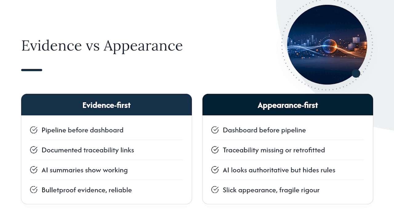
The genuine judgement this evidence supports is blunt: build the evidence pipeline first, then the dashboard. Organisations that reverse that order end up retrofitting traceability onto a live tool, which is far harder than designing it in from the start. Generative AI genuinely helps here, turning dense monitoring data into readable executive narratives, but only when every sentence it produces can be traced back to a specific rule and data point. An AI summary that cannot show its working is worse than no summary at all, because it looks authoritative while hiding exactly the thing an auditor needs to check.
Prioritise the unglamorous plumbing over the interface. A dashboard with three chart types and bulletproof evidence links beats a beautiful one with none, every time.
— peter
How Intelligent Assessments supports this design approach
Intelligentassessments is built for the exact problem this article describes: turning scattered spreadsheet-based assurance into a single, continuously updated evidence base. Rather than a generic dashboard tool bolted onto existing systems, it starts from structured assessment frameworks and evidence management, so every RAG status on screen links directly to the record, document or approval that produced it.
The platform maps closely onto the non-negotiables covered above: evidence is captured and linked automatically, dashboards update in real time rather than on a reporting cycle, and AI-generated executive summaries stay traceable back to the underlying data rather than floating free of it. Weighted RAG roll-ups run against template frameworks built for assessments, audits, compliance reviews and asset condition checks, with secure, role-based access controls suited to regulated utilities and infrastructure organisations. Template libraries mean assurance, PMO and governance teams do not have to design an evidence model from a blank page.
If your current dashboard cannot show its working, it's worth seeing what a continuous assurance platform looks like in practice. Book a demo to walk through how Intelligentassessments handles evidence linking, RAG roll-ups and explainable AI summaries on live data.
Sources
- Continuous Audit Metrics Catalog (Cloud Security Alliance)
- Measuring CIS controls in the real world (Gradum blog)