
The most useful risk dashboard examples for UK risk teams fall into five types: the board strategic dashboard, the operational risk command centre, the KRI/metrics tracker, the scenario and geopolitical monitor, and the sector-specific financial dashboard. Each serves a distinct audience and decision rhythm, and choosing the wrong type for the wrong audience is one of the most common reasons dashboards get ignored.
Here is who uses each and how often:
- Board strategic dashboard — board members and executive committee; monthly or quarterly; focused on top-tier risk appetite and strategic KRIs
- Operational risk command centre — operations leads and CRO; daily or real-time; focused on incident volumes, SLA breaches and control failures
- KRI/metrics tracker — risk managers and assurance teams; weekly or fortnightly; focused on leading and lagging indicator trends
- Scenario/geopolitical monitor — strategy, treasury and senior risk analysts; event-driven or weekly; focused on external threat signals and scenario scores
- Sector-specific financial dashboard — finance, treasury and regulatory affairs; monthly; focused on capital ratios, liquidity and regulatory thresholds
For UK regulated organisations, the single most important design constraint is data lineage and auditability. Every RAG status must trace back to a named owner, a defined threshold, and a timestamped data source. Without that, a dashboard is decoration, not governance.
Key takeaways
Effective risk dashboards for UK regulated organisations require the right dashboard type matched to the right audience, with named KRI owners, explicit RAG thresholds, and a full audit trail from data source to board report.
| Point | Details |
|---|---|
| Match dashboard to audience | Board, CRO, operations, audit, and regulatory teams each need a different metric set and update cadence. |
| Start with 4–6 KRIs | Validate data quality and decision use before expanding; most operational demos use this as a viable minimum. |
| RAG thresholds need two inputs | Set thresholds using both statistical baselines and business-informed tolerance levels; document both. |
| Audit trail is non-negotiable | Every threshold change and data source must be logged with owner and timestamp for UK regulatory review. |
| Intelligentassessments accelerates delivery | Pre-built templates, weighted RAG roll-ups, and evidence links reduce time-to-live for regulated organisations. |
Table of Contents
- Five concrete risk dashboard examples: what they show and who uses them
- Core components every risk dashboard needs
- Design principles: clarity, actionability and governance
- Which dashboard suits which audience?
- Data sources, KRI design and threshold rules
- Worked example: board risk dashboard template for UK regulated organisations
- How to choose or build: build vs buy and what to ask vendors
- Connecting risk dashboards to your existing IT infrastructure
- Customising dashboards for UK regulatory and compliance environments
- What dashboard projects actually get wrong
- Intelligentassessments supports dashboard delivery for regulated organisations
- Sources
Five concrete risk dashboard examples: what they show and who uses them
These five examples represent the most commonly requested types in UK regulated environments. Each is described with its core visualisations, intended audience, update cadence, and a minimum metric set.
1. Board strategic dashboard
The board dashboard gives non-executive directors and the executive committee a single-page view of the organisation's risk position against appetite. It does not show raw data. It shows aggregated RAG scores, trend arrows, and a short narrative box summarising the top three risks and their mitigations.
Audience: Board, ExCo, company secretary Cadence: Monthly pack; quarterly deep-dive
Must-have metrics:
- Top 5 risks by inherent and residual score
- Risk appetite utilisation (% of tolerance consumed)
- Number of risks rated red (breaching appetite)
- Control effectiveness score (aggregate)
- Emerging risk watch list (narrative)
Screenshot idea: A single-page PDF-exportable view with a 3×3 risk heatmap top-left, five RAG tiles centre, and a narrative text box bottom-right. Alt text: "Board strategic risk dashboard showing heatmap, RAG appetite tiles and executive narrative."
2. Operational risk command centre
The operational command centre is the dashboard your operations leads and CRO look at every morning. It is built for speed: live KPI tickers, alert feeds, and incident counts. The Plotly-based real-time operations dashboard is a useful open-source reference for the visual patterns here, including geographic heatmaps and system-health monitors.

Audience: CRO, operations managers, risk analysts Cadence: Real-time or daily refresh
Must-have metrics:
- Open incident count by severity
- Mean time to resolve (MTTR) by category
- SLA breach rate (%)
- Control failure alerts (live feed)
- Near-miss reports submitted (rolling 7 days)
Screenshot idea: Multi-tile dashboard with a live alert feed on the right, incident trend bar chart centre, and a geographic heatmap for site-level risk concentration. Alt text: "Operational risk command centre with live alert feed, MTTR tile and geographic heatmap."
Geckoboard's operations dashboard gallery shows comparable real-world layouts for health and safety, inventory, and warehouse performance that translate directly into operational risk monitoring.
3. KRI/metrics tracker
The KRI tracker is the workhorse of the risk function. It shows time-series trends for each key risk indicator, flags threshold breaches, and records the owner responsible for each metric. This is the dashboard that makes a risk register useful rather than archival.
Audience: Risk managers, assurance teams, internal audit Cadence: Weekly or fortnightly
Must-have metrics:
- KRI trend lines (12-week rolling) per risk category
- Threshold breach count (amber and red) by owner
- Leading vs lagging indicator split
- Evidence submission rate (% on time)
- Days since last review per risk
Screenshot idea: A multi-row time-series chart panel with RAG threshold bands overlaid, plus a summary table showing owner, last update and status. Alt text: "KRI metrics tracker showing 12-week trend lines with RAG threshold bands and owner summary table."
4. Scenario and geopolitical monitor
This dashboard tracks external threat signals rather than internal control performance. The canonical public example is BlackRock's geopolitical risk dashboard, which combines a market-attention score (how much media and analyst focus a geopolitical event is receiving) with a market-movement index (how much that event is actually moving asset prices). That two-axis approach is directly replicable for UK organisations monitoring energy price shocks, supply chain disruption, or regulatory change.
Audience: Strategy team, treasury, senior risk analysts Cadence: Event-driven; weekly summary
Must-have metrics:
- Attention score by scenario (media/analyst signal)
- Market-movement index by scenario
- Scenario probability rating (low/medium/high)
- Potential financial impact range (£)
- Trigger conditions for escalation
Screenshot idea: A scenario matrix with attention score on the x-axis and market impact on the y-axis, with named scenarios plotted as bubbles. Alt text: "Geopolitical scenario monitor showing attention-vs-impact matrix with named risk scenarios."
5. Sector-specific financial and regulatory dashboard
For UK banks, insurers, and regulated utilities, the dashboard must align with regulatory reporting requirements. The EBA Risk Dashboard is the sector benchmark: it presents time-series data on capital adequacy, asset quality, liquidity, and profitability across EU banking institutions, and it sets the standard for what regulators expect to see documented and trended over time.
Audience: Finance, treasury, regulatory affairs, board risk committee Cadence: Monthly; quarterly for regulatory submission
Must-have metrics:
- Common Equity Tier 1 (CET1) ratio vs regulatory minimum
- Non-performing loan (NPL) ratio trend
- Liquidity Coverage Ratio (LCR)
- Return on equity (RoE) vs peer benchmark
- Regulatory breach count (open and closed)
Screenshot idea: A panel of five ratio tiles with trend sparklines, a regulatory breach log table, and a period-comparison bar chart. Alt text: "Sector-specific financial risk dashboard showing CET1, LCR and NPL ratio tiles with trend sparklines."
Pro Tip: Start with the sector-specific dashboard if your organisation faces a regulatory submission deadline. The EBA's published indicator set gives you a pre-validated KRI list that regulators already accept, which cuts your threshold-design effort significantly.
Core components every risk dashboard needs
The visual building blocks of a risk dashboard are not interchangeable. Each serves a specific analytical purpose, and using the wrong one for the wrong data type creates confusion rather than clarity.
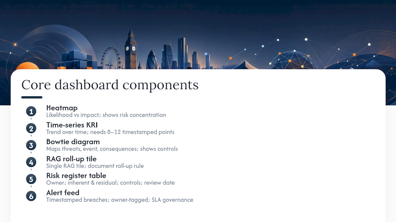
Heatmap (risk concentration) A heatmap plots likelihood against impact for a population of risks. It is the right choice when you need to show concentration: where are most risks clustering? It requires a scored risk register with consistent likelihood and impact ratings. The weakness is that it compresses time, so it cannot show whether the position is improving or deteriorating.
Time-series KRI chart (trend monitoring) A line or bar chart with RAG threshold bands overlaid is the standard for KRI tracking. It answers the question a heatmap cannot: is this getting better or worse? The data requirement is a consistent, timestamped KRI feed with at least 8–12 data points to make the trend meaningful.
Bowtie diagram (causal clarity) A bowtie maps threats on the left, consequences on the right, and the risk event in the centre, with preventive controls on the left-hand arrows and recovery controls on the right. It is the most effective visual for communicating root-cause logic to a board or regulator. The data requirement is a structured control library mapped to each risk.
RAG roll-up tile (executive summary) A single RAG tile aggregates multiple KRIs into one status indicator. The roll-up logic must be explicit: is it the worst-child rule (one red KRI makes the tile red), a weighted average, or a threshold count? Documenting the roll-up rule is as important as the tile itself. Guidance on RAG thresholds and governance covers the mechanics in detail.
Risk register roll-up table A sortable table of risks with columns for owner, inherent score, residual score, control status, and last review date. This is the backbone of the dashboard, not a visual flourish. Every other component should be filterable back to a row in this table.
Alert feed (live operational monitoring) A scrolling or paginated feed of threshold breaches and control failures, timestamped and owner-tagged. The da-ops-command-center demonstrates this pattern well, with SLA governance and incident management tabs that keep operational noise separated from strategic signal.
Pro Tip: Show raw data only in the KRI tracker and alert feed. Every other dashboard layer should show aggregated indicators. A board member who has to interpret a raw data table has been failed by the dashboard designer, not by their own analytical ability.
Design principles: clarity, actionability and governance
Good dashboard design is not about aesthetics. It is about making the right decision obvious to the right person in the shortest time. Forrester's 2025 enterprise risk management analysis points to integrated ERM dashboards at executive level as a rising expectation, which means the bar for clarity and auditability is moving up, not down.
Core design principles:
- One metric purpose per tile. A tile that shows three things shows nothing clearly.
- Explicit thresholds on every KRI. If the threshold is not visible, the RAG status is unverifiable.
- Consistent time windows across the dashboard. Mixing a 30-day trend with a 7-day count on the same page misleads the reader.
- Colour used for status only. Never use red and green for anything other than RAG status. Decorative colour destroys the signal.
- Owner labelled on every metric. A KRI without an owner is an observation, not a managed indicator.
- Mobile-readable layout for on-call operations teams. A dashboard that requires a 27-inch monitor is not an operational tool.
Common design mistakes to avoid:
- Too many KPIs on a single view. Twelve tiles is usually the practical maximum before the eye stops reading.
- Ambiguous legends. If a user has to hover to understand what a colour means, the legend has failed.
- Stale data with no timestamp. Always show the last-refresh time, prominently.
- Threshold changes with no audit trail. Every change to a RAG threshold must be logged with the approver's name and date.
- Aggregating incompatible metrics. Averaging a percentage with an absolute count produces a number that means nothing.
Governance pointers:
Every dashboard needs a named data owner, a named dashboard owner, a documented update cadence, and a change-control process for thresholds. For UK regulated organisations, the dashboard itself is evidence: it will be reviewed by internal audit, external audit, and potentially the regulator. That means version control and data lineage are not optional extras.
Which dashboard suits which audience?
Mapping the right dashboard to the right audience is where most implementations go wrong. The instinct is to build one dashboard and give everyone access. The result is a view that serves no one well.
| Audience | Top 4 metrics | Cadence | Decision trigger |
|---|---|---|---|
| Board / ExCo | Risk appetite utilisation, top 5 residual risks, control effectiveness, emerging risk watch list | Monthly | Appetite breach or new top-tier risk |
| CRO | KRI breach count, MTTR, open high-severity incidents, control failure rate | Weekly | Two or more amber KRIs in one category |
| Operations manager | Incident volume by site, SLA breach rate, near-miss count, corrective action overdue | Daily | Any red SLA or open P1 incident |
| Internal audit | Evidence submission rate, overdue reviews, control test results, audit finding age | Monthly | Overdue evidence or repeat finding |
| Regulatory liaison | CET1 ratio, LCR, NPL ratio, regulatory breach log | Monthly / quarterly | Ratio approaching regulatory minimum |
Minimum metric checklist per audience:
- Board: risk appetite utilisation + top 5 residual risks. Everything else is context.
- CRO: MTTR + KRI breach count. These two metrics tell you whether the organisation is managing incidents and whether the risk profile is stable.
- Operations: incident volume + SLA breach rate. The two fastest signals of operational deterioration.
- Audit: evidence submission rate + overdue reviews. Audit effectiveness lives or dies on these.
Escalation rules should be documented in the dashboard itself, not in a separate policy document. A CRO who has to open a PDF to find out when to escalate a red KRI will not escalate consistently. Role-based views, as demonstrated in open SaaS dashboard demos, materially increase adoption by showing each audience only the metrics relevant to their decisions.
Data sources, KRI design and threshold rules
A dashboard is only as credible as the data feeding it. The most common failure mode is not poor visualisation; it is poor data quality upstream.
Common data sources for UK risk dashboards:
- Finance systems (ERP, general ledger) for financial KRIs and budget variance
- SIEM and security platforms for cyber risk indicators and alert volumes
- Incident management systems (ServiceNow, Jira Service Management) for MTTR and incident counts
- HR systems for conduct risk indicators: staff turnover, grievance rates, training completion
- OT/SCADA systems for operational technology risk in utilities and infrastructure
- Regulatory reporting systems for capital and liquidity ratios
- Assessment and audit platforms for control effectiveness scores and evidence submission rates
A single source of truth for risk data is not a luxury for regulated organisations; it is the foundation of a defensible dashboard.
KRI design rules:
- Classify every KRI as leading (predictive) or lagging (outcome). A dashboard with only lagging indicators tells you what went wrong, not what is about to.
- Set thresholds using two methods: statistical (based on historical distribution) and business-informed (based on what the organisation can tolerate). Where they conflict, the business-informed threshold governs.
- Assign a named owner to every KRI before the dashboard goes live. Ownership without a name is not ownership.
- Define update frequency at the KRI level, not the dashboard level. A cyber alert feed updates in real time; a capital ratio updates monthly. Both can live on the same dashboard if the cadence is labelled.
Implementation timeline and cost drivers:
| Phase | Milestone | Typical duration |
|---|---|---|
| Discovery | Data source audit, KRI shortlist, owner assignment | 2–4 weeks |
| Design | Wireframes, threshold rules, RAG logic sign-off | 2–3 weeks |
| Build | Data integration, visualisation build, UAT | 4–8 weeks |
| Pilot | Live with one audience, validation and iteration | 4 weeks |
| Rollout | Full audience deployment, training, governance docs | 2–4 weeks |
Cost drivers include the number of data integrations (each adds time and licence cost), the visualisation platform chosen, and the staff effort required to validate KRI data before go-live. A dashboard built on clean, already-integrated data can be live in eight weeks. One that requires new data pipelines from OT systems or legacy ERPs will take longer.
Worked example: board risk dashboard template for UK regulated organisations
The board risk dashboard is the highest-stakes output of the risk function. It is read by people who have limited time, high accountability, and no tolerance for ambiguity. The template below is adapted for UK regulated organisations and aligned with the continuous assurance approach used in the Intelligentassessments platform.
Template contents:
- Header row: Organisation name, reporting period, dashboard owner, last-refresh timestamp
- Section 1 — Risk appetite summary: Five RAG tiles, one per strategic risk category (financial, operational, regulatory, reputational, strategic). Each tile shows the category name, current RAG status, and a one-line narrative.
- Section 2 — Top risks table: Ranked list of the top 5 risks by residual score, with columns for risk name, owner, inherent score, residual score, control status, and trend arrow.
- Section 3 — KRI summary panel: Six KRI tiles showing the most critical leading and lagging indicators, each with a 3-month sparkline and threshold band.
- Section 4 — Emerging risk watch list: A short narrative box (3–5 bullets) flagging risks not yet scored but requiring board awareness.
- Section 5 — Controls and mitigations narrative: A 100–150 word executive summary of the most significant control weaknesses and the mitigations in progress.
Annotated callouts:
- Place the RAG appetite tiles at the top of the page. The board's first question is always "are we in appetite?" Answer it before they have to scroll.
- The top risks table should be sortable by residual score in the digital version, but the PDF export should always show the top 5 pre-sorted.
- Link each KRI tile to the underlying evidence in the assurance platform. A board member who wants to drill down should be one click from the source data, not three emails.
Pro Tip: For the first 90 days, run the dashboard in parallel with your existing board report. Do not replace the report; supplement it. This gives you a validation period to catch data errors before the dashboard becomes the primary governance document. After 90 days, the dashboard should be the report.
90-day rollout milestones:
- Days 1–30: Agree the KRI shortlist (no more than 12), assign owners, document thresholds, and connect the first two data sources.
- Days 31–60: Build the dashboard, run UAT with the risk team, and present a draft to the CRO for sign-off.
- Days 61–90: Present to the board risk committee, collect feedback, iterate, and establish the monthly governance rhythm.
For portfolio-level governance, the project portfolio dashboard guide covers how to extend this template to programme and delivery risk.
How to choose or build: build vs buy and what to ask vendors
The build-vs-buy decision for a risk dashboard is rarely about capability. Most modern BI tools can produce a serviceable dashboard. The real question is about ownership, auditability, and how much of your team's time you want to spend maintaining data pipelines rather than managing risk.
Build vs buy checklist:
- Speed to value: A bought platform with pre-built templates can be live in weeks. A custom build in Power BI or Tableau typically takes months once data integration effort is included.
- Regulatory evidence requirements: Regulated UK organisations need an audit trail for threshold changes, data lineage documentation, and version-controlled dashboard outputs. Custom builds require this to be engineered separately; purpose-built platforms include it.
- Integration complexity: If your risk data lives in more than three systems, a purpose-built platform with pre-built connectors will cost less in integration effort than a custom build.
- Ownership risk: A dashboard built by a single analyst in Power BI is a key-person dependency. A platform subscription is not.
- Total cost of ownership: Factor in staff time for maintenance, data quality management, and version control, not just the licence fee.
For a broader view of AI risk tooling for UK regulated organisations, the build-vs-buy trade-offs are covered in detail.
Vendor questions for regulated UK organisations:
- Can you export all data, including audit trail and threshold history, in a standard format (CSV, JSON)?
- Does the platform maintain a full audit log of who changed which threshold, when, and with whose approval?
- Can RAG thresholds be automated based on data rules, not just manual updates?
- Does the platform support role-based views so a board member sees a different layer from an operations manager?
- What is the SLA for support, and is there a UK-based support contact?
- How does the platform handle data residency requirements for UK-regulated data?
Selection criteria specific to UK regulated organisations:
- Evidence retention: the platform must store the underlying data and evidence that produced each RAG status, not just the status itself.
- Secure access controls: role-based permissions, MFA, and data residency in UK or EEA data centres.
- Compliance features: pre-built frameworks aligned to UK regulatory expectations (FCA, Ofwat, ORR, or sector equivalent).
- Exportable audit trail: a PDF or CSV export of the full dashboard history for regulatory submission.
Connecting risk dashboards to your existing IT infrastructure
A risk dashboard that cannot pull live data from your core systems is a reporting exercise, not a monitoring tool. The integration architecture is often where dashboard projects stall, and it deserves the same design attention as the visualisation layer.
The most common integration patterns for UK regulated organisations are API connections to ERP and finance systems, SIEM log ingestion for cyber risk indicators, and flat-file imports from legacy OT or SCADA systems where real-time APIs are not available. Each pattern carries different latency: an API connection can refresh in minutes; a flat-file import is typically daily or weekly.
For operational dashboards, the real-time operations dashboard patterns demonstrated in open-source tooling show how live KPI tickers and alert feeds can be built on streaming data, which is the architecture to aim for in a command-centre context. For board and strategic dashboards, a daily or weekly batch refresh is usually sufficient and considerably simpler to maintain.
Data governance at the integration layer matters as much as at the visualisation layer. Every data feed should have a named owner, a documented refresh schedule, and an alerting mechanism for feed failures. A dashboard that silently shows stale data because a feed broke on Friday afternoon is worse than no dashboard at all.
Real-time compliance monitoring patterns for regulated organisations cover the specific integration considerations for compliance KRIs, including how to handle data that arrives in batches from regulatory systems.
Customising dashboards for UK regulatory and compliance environments
UK regulated organisations operate under sector-specific frameworks that shape which KRIs matter, what thresholds are defensible, and what evidence a regulator will accept. A dashboard designed for a generic enterprise risk function will not meet the expectations of the FCA, Ofwat, ORR, or the Prudential Regulation Authority without customisation.
The most important customisation is the KRI set itself. For financial services firms, the EBA's published indicator framework, which covers capital adequacy, asset quality, profitability, and liquidity, provides a pre-validated starting point that regulators already recognise. For utilities, the relevant framework is the sector regulator's performance reporting requirements, which typically include customer service metrics, asset health indicators, and environmental compliance rates.
Threshold customisation is the second critical layer. A capital ratio threshold for a UK bank is set partly by the PRA's minimum requirements and partly by the firm's own risk appetite above that floor. The dashboard must show both: the regulatory minimum as a hard floor and the internal appetite threshold as the amber trigger. Showing only one or the other creates a misleading picture.

Narrative boxes are often overlooked in template designs but are required by most UK board risk committee terms of reference. The dashboard must not only show the RAG status; it must explain it. A 100-word narrative box per risk category, updated by the risk owner, is the difference between a dashboard that satisfies governance requirements and one that does not.
For organisations subject to the Senior Managers and Certification Regime (SM&CR), the dashboard should map each risk category to the named Senior Manager responsible. That mapping makes accountability explicit and traceable, which is exactly what the regime requires.
What dashboard projects actually get wrong
Most risk dashboard projects fail not because of technology choices but because of three recurring mistakes that are entirely avoidable.
The first is overlayering. Teams add metrics because they are available, not because they drive a decision. A dashboard with 40 KPIs is a data dump. The discipline of asking "what decision does this metric support, and who makes it?" before adding any tile eliminates most of the noise. Start with four to six KRIs per audience, validate that they are actually being used to make decisions, and only then expand.
The second is missing owners. A KRI without a named, accountable owner will drift. The data will go stale, the threshold will become irrelevant, and the dashboard will quietly stop being trusted. Ownership must be assigned before the dashboard goes live, not after.
The third is poor data quality at the source. No amount of good visualisation design fixes a KRI that is calculated inconsistently across business units or sourced from a spreadsheet that three people maintain independently. The data quality audit should happen before the dashboard is designed, not during UAT.
One pattern that consistently produces improvement: run a 30-day validation period where the risk team manually checks every KRI value against the source system before it appears on the dashboard. It is tedious, but it catches the data quality issues that would otherwise surface in front of the board. Organisations that do this typically find that two or three of their planned KRIs are not actually measurable from available data, and they replace them with indicators that are, which produces a more credible dashboard from day one.
The governance rhythm matters as much as the initial build. A dashboard that is not reviewed, challenged, and updated quarterly will become stale within six months. Assign a quarterly dashboard review to the risk committee agenda, with a standing item to confirm that thresholds remain appropriate and owners remain current.
Intelligentassessments supports dashboard delivery for regulated organisations
Regulated organisations that need a board risk dashboard live within weeks, not months, have a direct route through the Intelligentassessments platform. The platform delivers weighted RAG scoring and roll-ups, evidence links from each KRI tile to the underlying assessment data, and a full audit trail of threshold changes and owner assignments. That combination is what makes a dashboard defensible to an internal auditor or a sector regulator, not just readable by a board member.
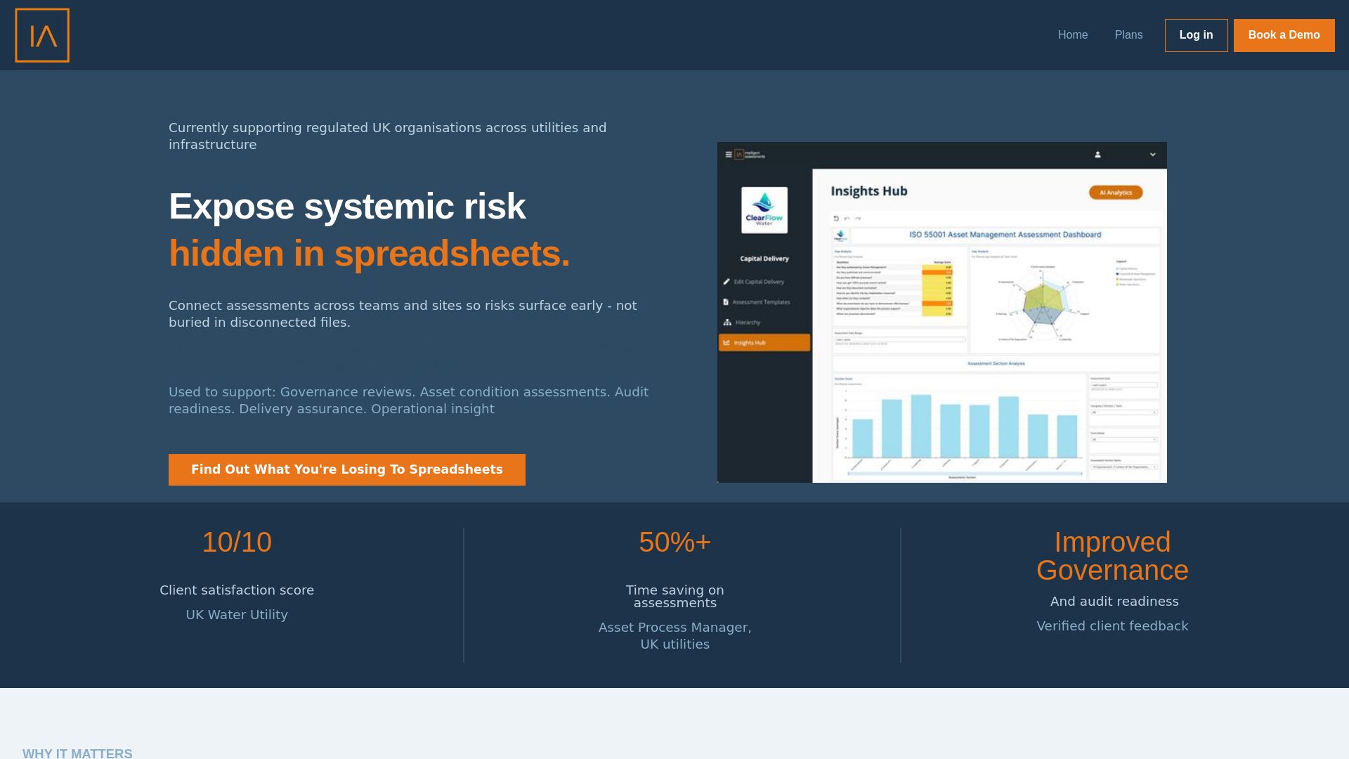
The platform includes pre-built assessment frameworks and dashboard templates calibrated for UK regulated utilities and infrastructure organisations, which means the KRI set and RAG logic are already aligned to what your sector regulator expects to see. Data security is handled through role-based access controls and UK data residency, with no data leaving the jurisdiction.
Book a demo to see a template walkthrough and discuss your integration scope. The session covers the board dashboard template, KRI configuration, and how the platform connects to your existing data sources.
Sources
- Risk dashboard | European Banking Authority
- Geopolitical Risk Dashboard | BlackRock
- 6 Operations dashboard examples | Geckoboard
- mayankjoshiii/realtime-operations-dashboard
- The state of enterprise risk management 2025 | Forrester